website redesign
A website redesign for an academy helping newcomers, students, and professionals find their footing in Canada.
00

problem
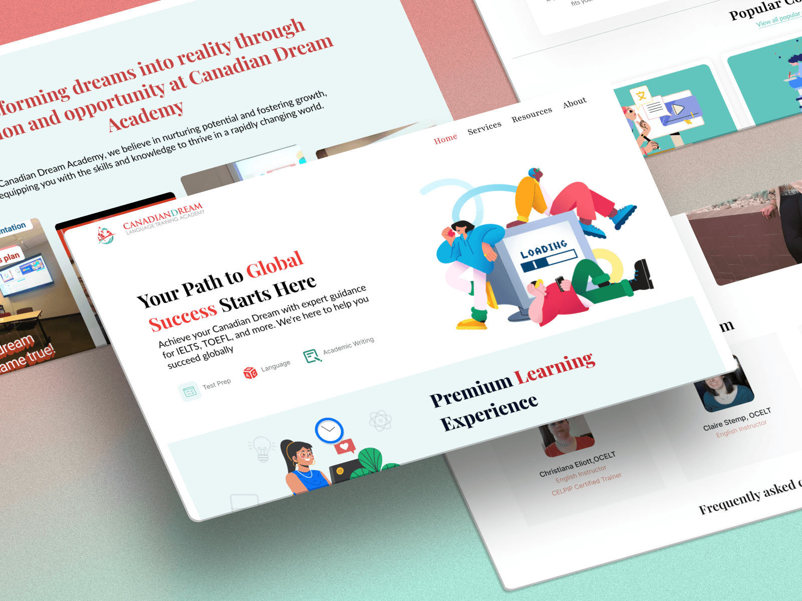
The people Canadian Dream Academy serves are already navigating one of the hardest transitions a person can make. Starting over in a new country, learning a new language, rebuilding a career from scratch. The last thing they needed was a website that added friction to that journey. But that's what they had. Critical information about programs, admissions, and next steps was buried or unclear, leaving prospective students frustrated enough to leave before they ever made contact. The calls to action didn't call. The mobile experience was an afterthought. And for users who were still developing their English or relying on assistive technology, the barriers were even higher. A website is often the first handshake an institution offers. This one wasn't doing the job.
solution
The redesign started with the people most likely to land on that homepage: a newcomer preparing for an English proficiency exam, a high school student looking to improve, a licensed professional who needed certification to work in their field. Three very different people with three very different needs, all arriving at the same front door. Getting clarity on those personas shaped every decision that followed, from the information architecture down to the calls to action. I rebuilt the navigation to put the most critical pathways front and centre, rewrote the user flows so the next step was never a guessing game, and brought the mobile experience up to the standard the audience actually needed. Accessibility wasn't treated as a feature to add at the end. It was a constraint that informed the design from the start, particularly for users still building confidence in English. The redesign was completed in eight weeks, working within the constraints of the Wix platform, using Figma with Wix-aligned plugins to keep the design process tight and the handoff clean. The goal was a website that felt as welcoming as the institution it represented.
From the beginning, this project was about removing barriers for people who had already cleared so many. Canadian Dream Academy exists to give newcomers a real foothold in their new lives, and I wanted the website to carry that same generosity. The question wasn't how to make something that looked better.
Throughout the process, the constraints kept the work honest. Eight weeks, a platform I hadn't worked in before, and limited access to formal user testing. In another context those might have felt like obstacles. Here they felt appropriate. The people this website was built for didn't have the luxury of ideal conditions either. They were navigating new systems, new language, new everything. The least I could do was find a way to work with what was available and make something that served them well anyway.
Building the three personas early was what made the rest possible. It turned an abstract redesign brief into a series of concrete questions. Could a newcomer who just arrived in Canada find the right program in under a minute? Could a professional understand exactly what certification they needed and how to get it without calling anyone? Those questions cut through every decision about layout, hierarchy, and language. The calls to action stopped being design elements and started being commitments.
What the project reinforced, more than anything, was that good design for vulnerable users isn't about doing something special or elaborate. It's about doing the basics with real care. Clear language. Logical flow. A mobile experience that doesn't punish people for not being on a desktop. A first impression that feels like a welcome rather than a wall.
01

02

see also


